
02
Genesis customer management
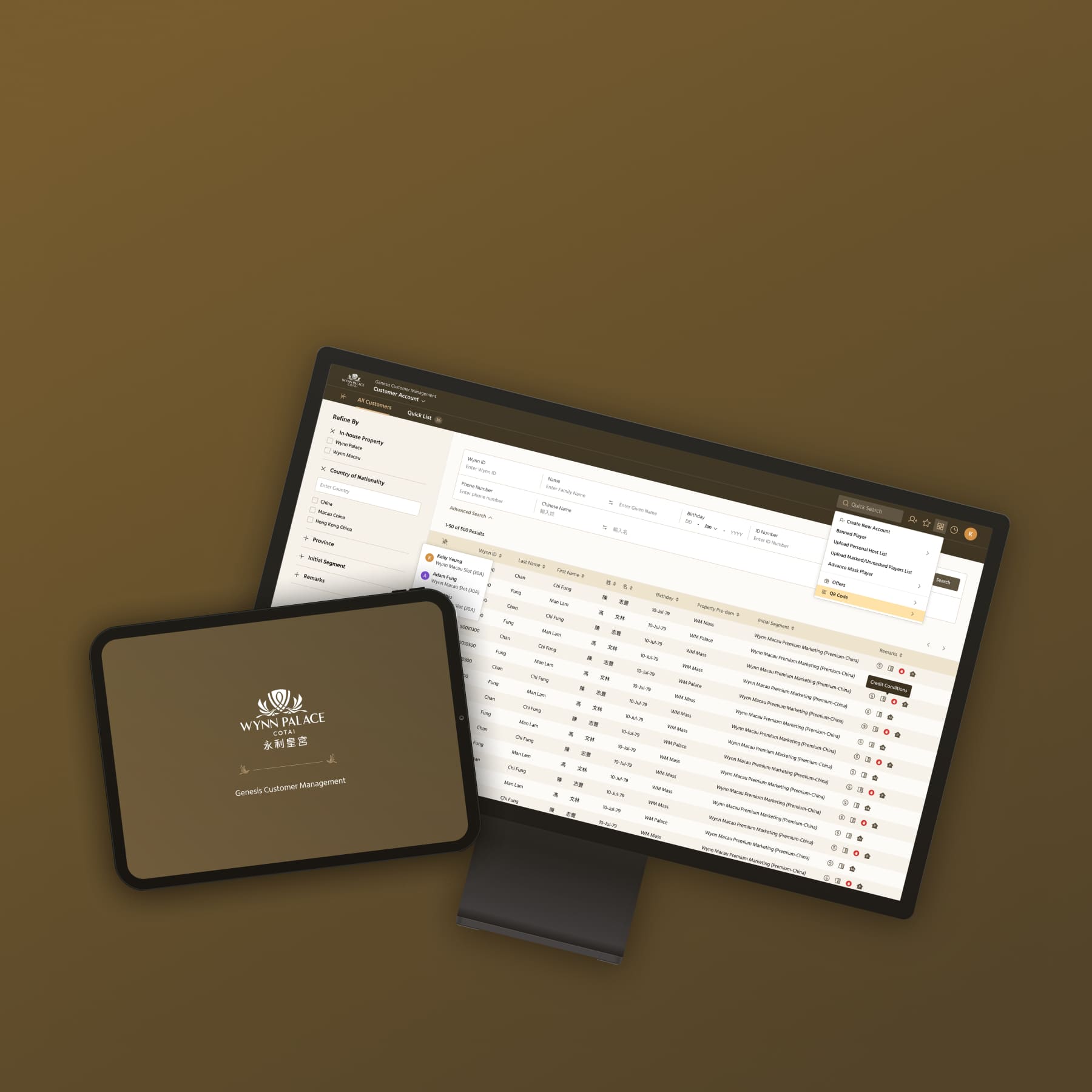
Wynn Palace is a luxury integrated resort and casino in Macau. Genesis Customer Management is an internal platform used by casino customer service teams to manage customer information, activities, and day-to-day operations.
client
Wynn Palace
year
2022
deliverables
Design system
Dashboard design
Dashboard design
scope
Macau
overview
The project focused on modernising the legacy customer management system into a more intuitive, efficient, and visually refined experience for internal users. Through user interviews and workflow analysis, we identified opportunities to simplify complex processes, improve information hierarchy, and establish a more contemporary visual language for managing large amounts of customer data.
/1
understanding the existing experience
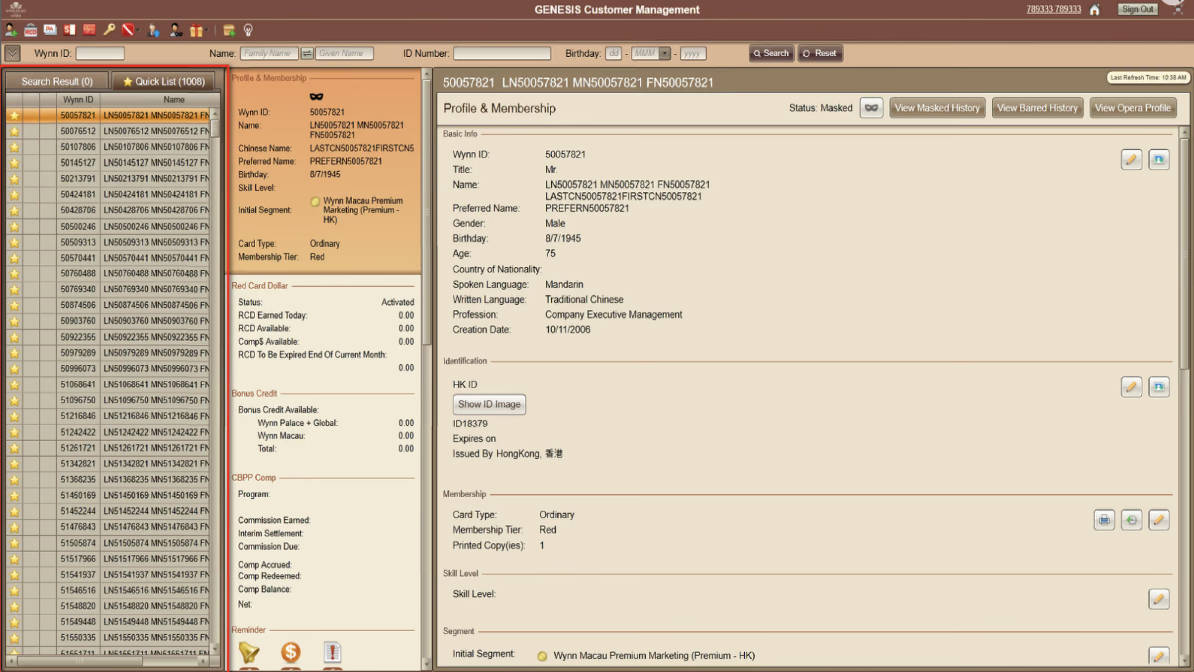
The existing customer management system had evolved over time to support a wide range of operational needs, but this resulted in a complex interface with large amounts of information presented across multiple screens. In addition, the outdated visual style would further reduce clarity and made the system feel less intuitive to use.
/2
user research
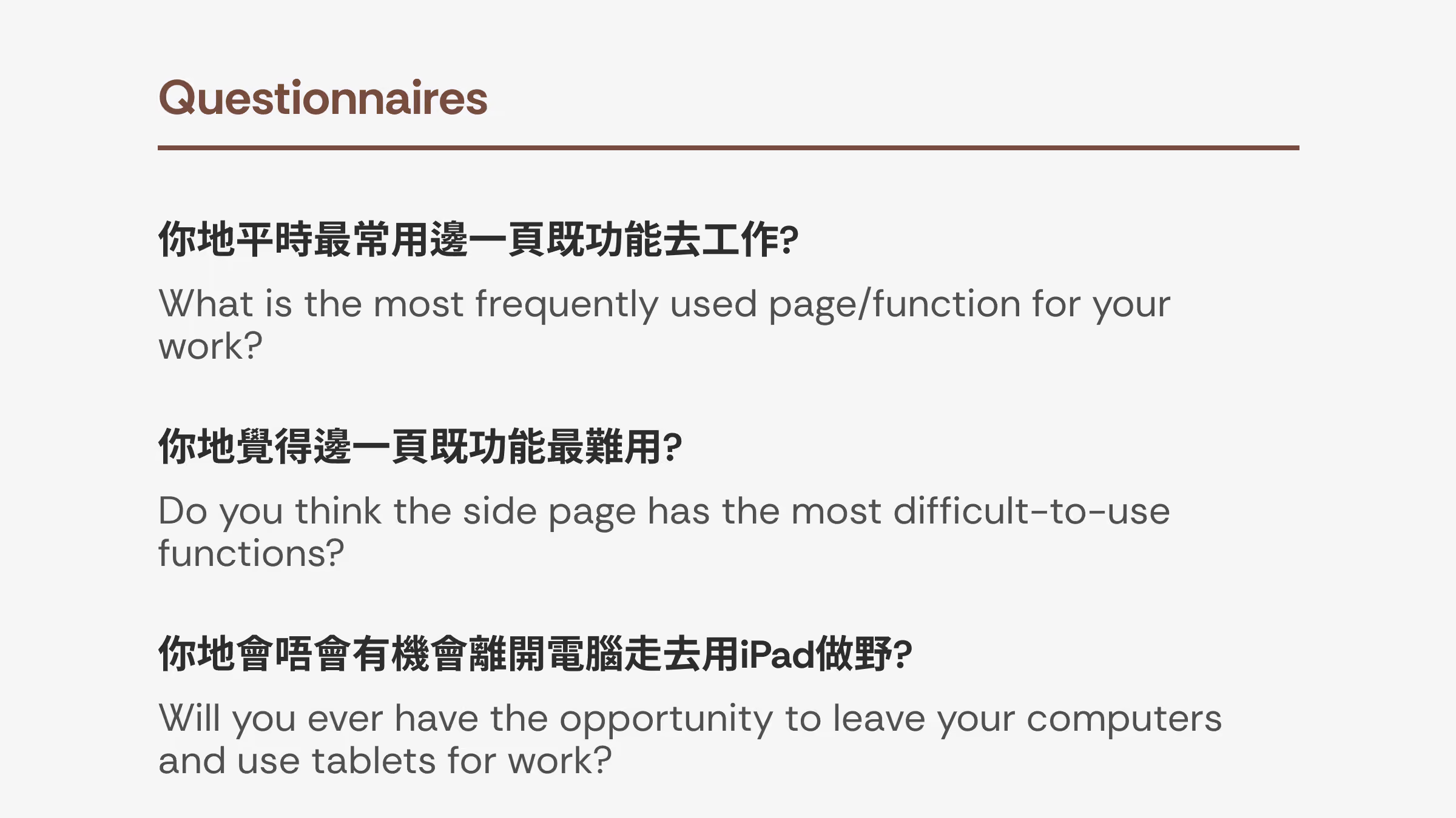
To understand the real challenges behind the existing experience, we conducted phone call interviews and questionnaires with customer service users who worked with the system regularly.
findings
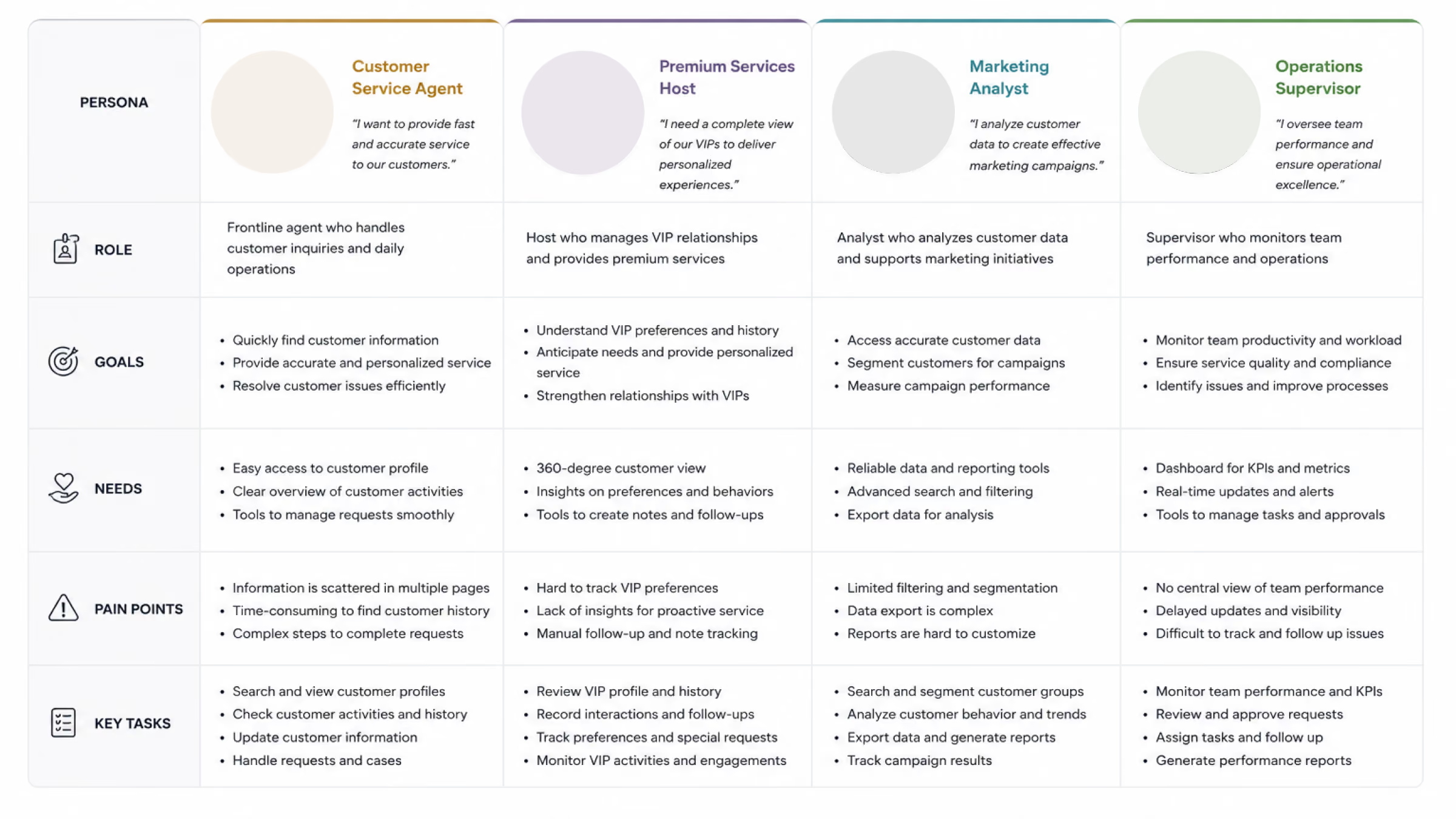
Rather than focusing only on visual issues, we created peronas and explored how users completed their daily tasks, what information they needed most, and where they encountered unnecessary steps or confusion.
We also learned that users primarily worked across desktop and tablet environments, with tablet being used in some operational cases. However, the existing interface was not well-optimised for smaller screens, making it difficult to read and interact with dense information on tablet devices.
We also learned that users primarily worked across desktop and tablet environments, with tablet being used in some operational cases. However, the existing interface was not well-optimised for smaller screens, making it difficult to read and interact with dense information on tablet devices.
/3
building design system
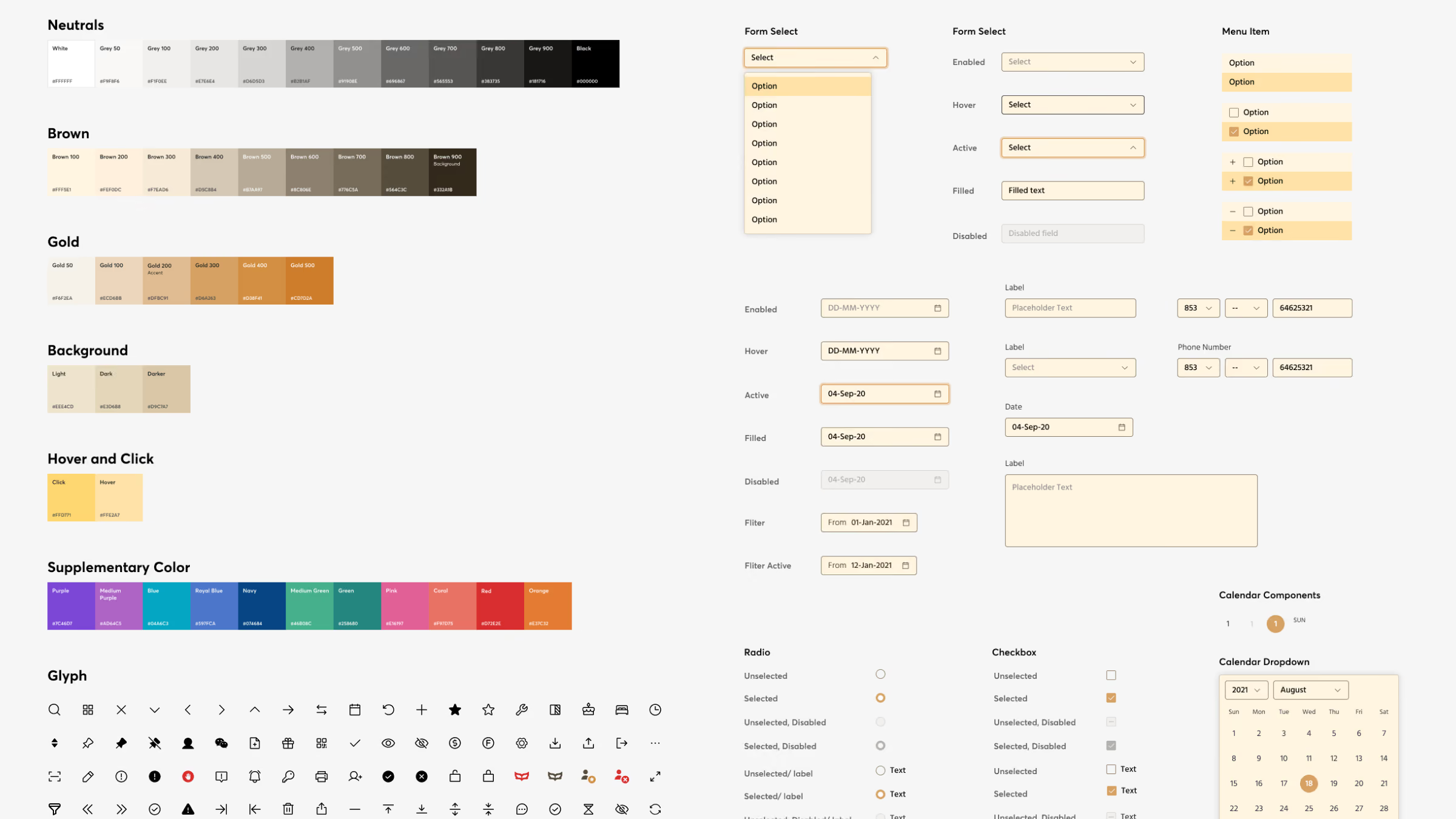
As part of the redesign, we also created a new design system for Genesis to establish a consistent visual and interaction language across the platform.
The system defined core foundations such as typography, color, spacing, grid, and iconography, alongside reusable components and interaction states. This allowed us to move away from the inconsistent patterns of the legacy system and create a more cohesive experience across different screens and workflows.
The system defined core foundations such as typography, color, spacing, grid, and iconography, alongside reusable components and interaction states. This allowed us to move away from the inconsistent patterns of the legacy system and create a more cohesive experience across different screens and workflows.
/4
dashboard design
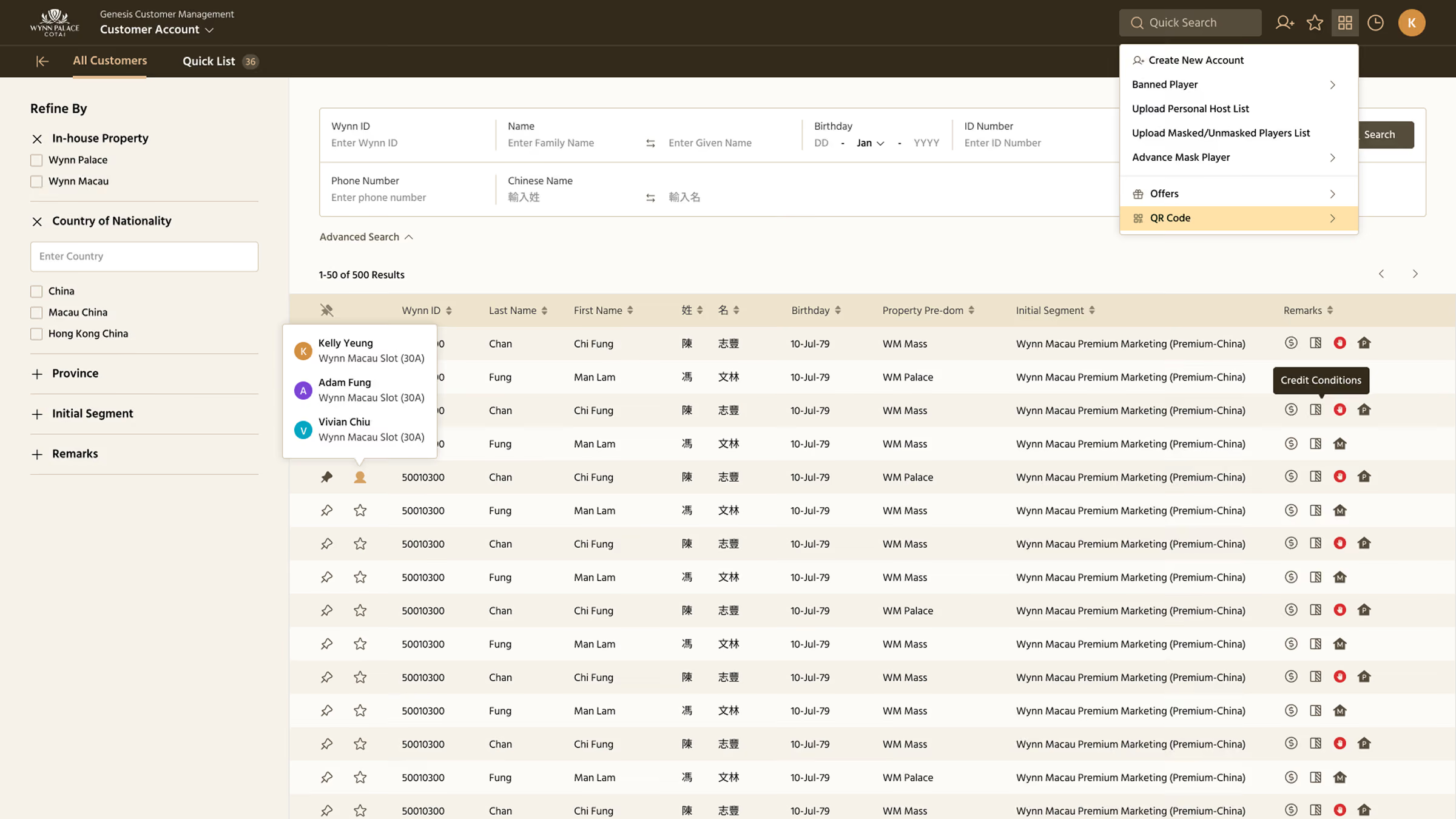
Rather than adding more visual elements to communicate more information, the dashboard design focused on creating information clarity through hierarchy, grouping, and progressive disclosure.
organizing complex data
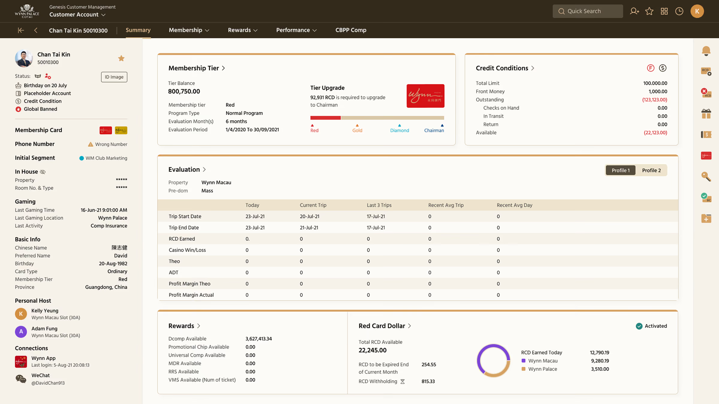
One of the key insights from user research was that users wanted to see the most important information immediately, so they could quickly understand a customer’s status and take action without unnecessary navigation.
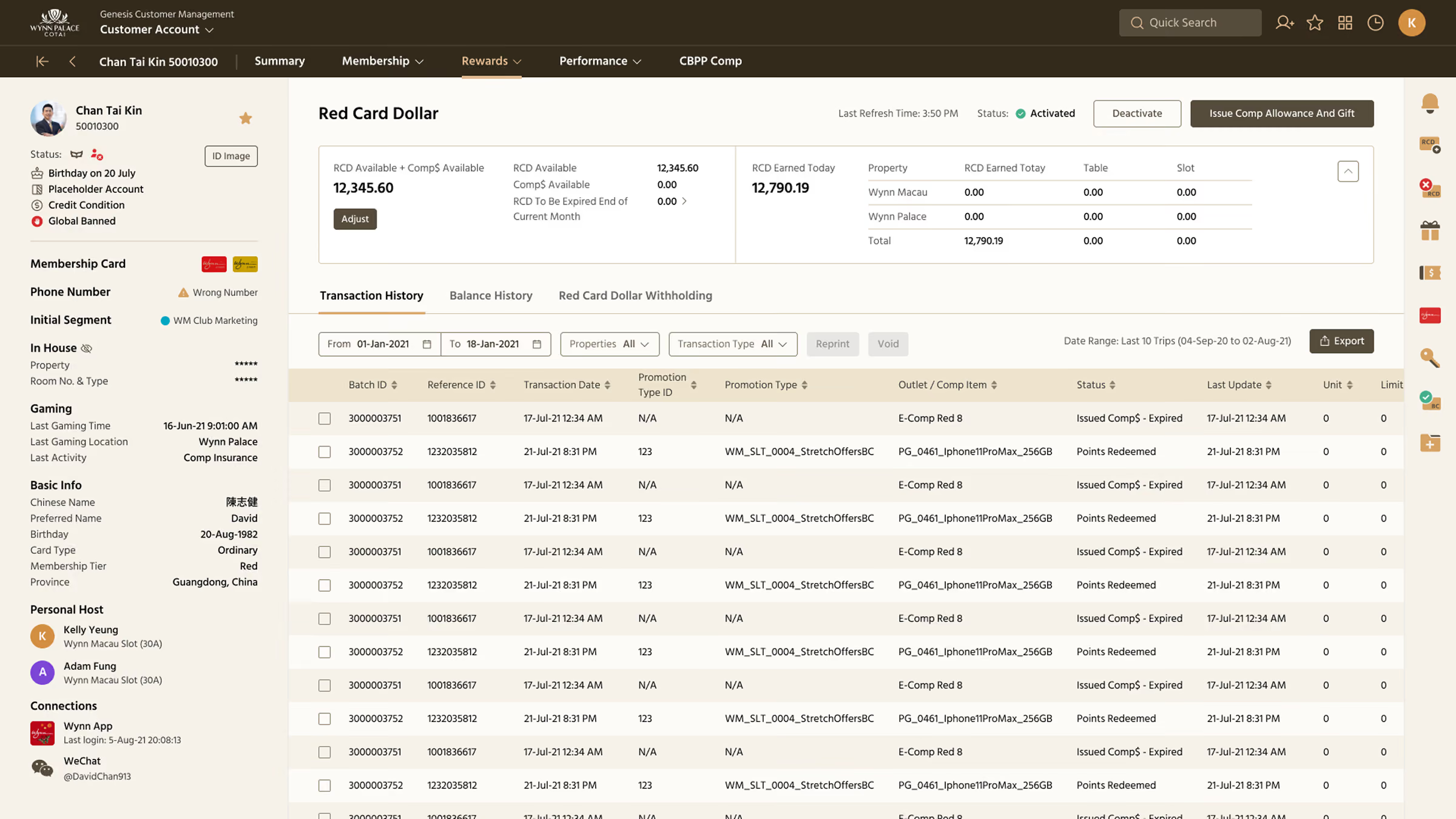
To support this, we redesigned the information hierarchy to surface critical data directly on the screen, placing key customer information in prominent positions where it could be seen at a glance. Less frequently used or secondary details were still available, but grouped into clear sections that users could access when needed.
To support this, we redesigned the information hierarchy to surface critical data directly on the screen, placing key customer information in prominent positions where it could be seen at a glance. Less frequently used or secondary details were still available, but grouped into clear sections that users could access when needed.
desktop & tablet breakpoint
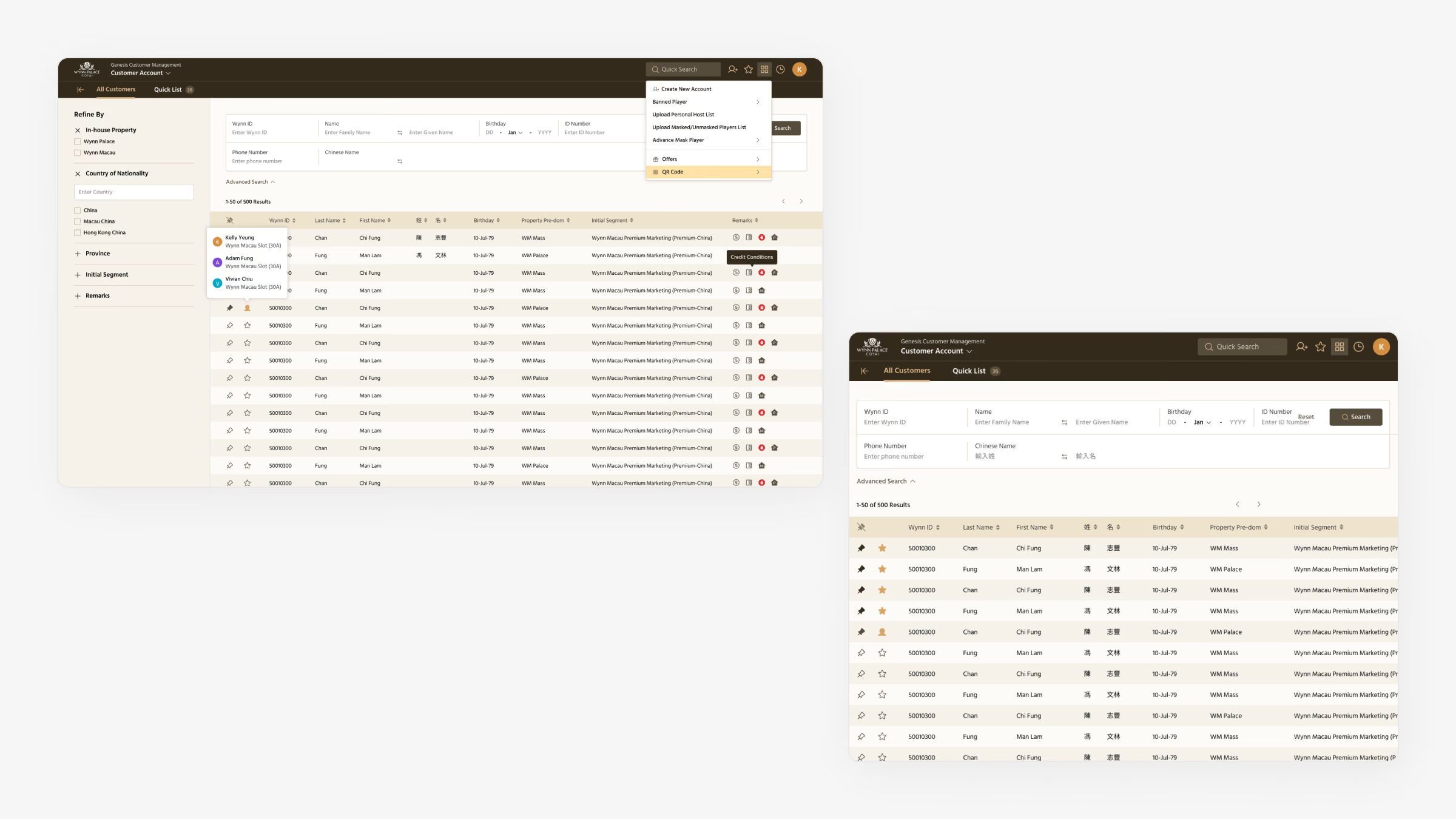
The system needed to support two different devices, the desktop workstations and tablet devices used by customer service teams.
The responsive approach allowed users to access the same core functionality while maintaining an efficient experience across both desktop and tablet.
The responsive approach allowed users to access the same core functionality while maintaining an efficient experience across both desktop and tablet.
workflow usability
We defined interaction patterns for common actions such as filtering, searching, editing, expanding information, and navigating between customer records. Feedback, hover, focus, loading, and error states were also considered to make interactions clear and predictable.
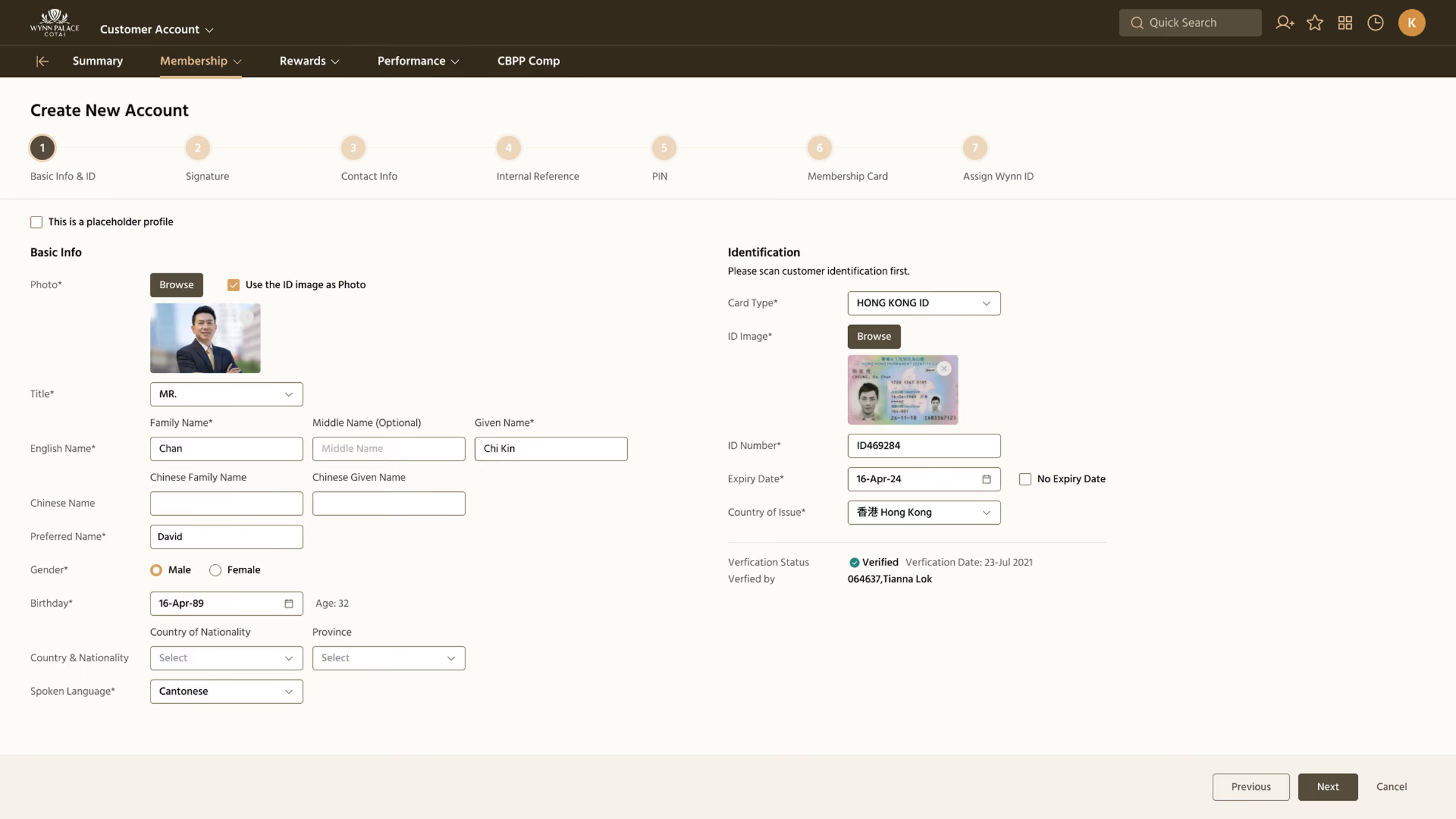
According to user needs, we also introduced multiple sections within a single screen to support complex workflows. This allows users to group related steps together, improving information clarity and enabling faster task completion.
According to user needs, we also introduced multiple sections within a single screen to support complex workflows. This allows users to group related steps together, improving information clarity and enabling faster task completion.

.svg)