
01
Helios design system
Helios is Sun Life's global design system, developed to replace and modernize the previous system. It provides a unified, accessible, and scalable foundation for building consistent digital experiences across web and mobile products.
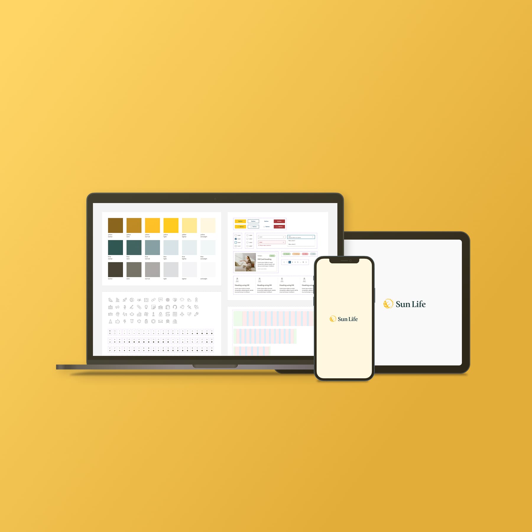
client
Sun Life
year
2023 - now
deliverables
Design system
Design documentation
Design documentation
scope
Global
my role
I worked across the Helios Design System from its early design direction to product adoption. My responsibilities included defining design foundations, designing components and interactions, improving accessibility, creating documentation, and later restructuring the system with design tokens.
Throughout the process, I worked closely with designers, developers, and product teams across different regions to understand their needs and ensure Helios worked effectively in real product environments.
Throughout the process, I worked closely with designers, developers, and product teams across different regions to understand their needs and ensure Helios worked effectively in real product environments.
/1
auditing the existing experience
As Sun Life’s digital ecosystem grew globally, the old design system struggled to maintain consistency across products. A review of existing websites and applications revealed inconsistencies in components and outdated visual styles.
Helios was created as a new global design system to provide a more consistent, accessible, and scalable foundation for Sun Life’s digital experiences.
Helios was created as a new global design system to provide a more consistent, accessible, and scalable foundation for Sun Life’s digital experiences.
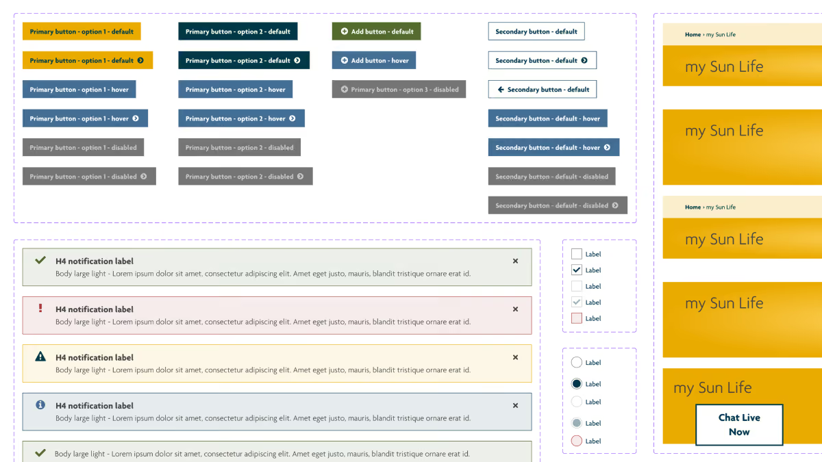
Old design system
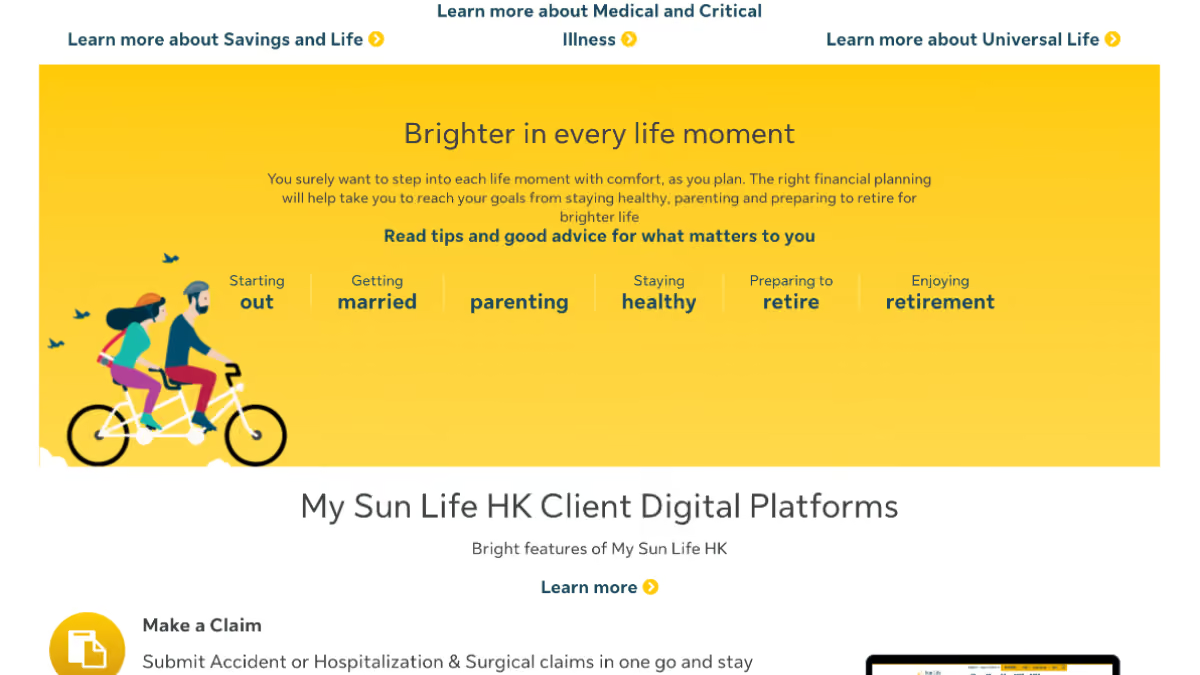
Old public site
/2
building design foundation
After established the new visual direction that aligned with Sun Life’s brand identity, I focused on creating the core foundations of Helios, including grid systems, typography, color systems, spacing principles, and layout structures.
These foundations served as the building blocks for the entire design system, ensuring every component was created with consistency, accessibility, and scalability in mind.
These foundations served as the building blocks for the entire design system, ensuring every component was created with consistency, accessibility, and scalability in mind.
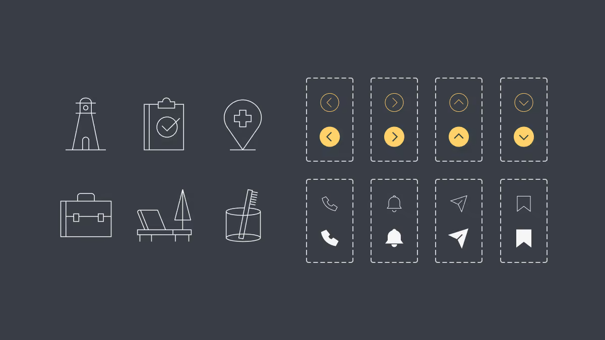
150+ Decorative icons / 160+ Action icons
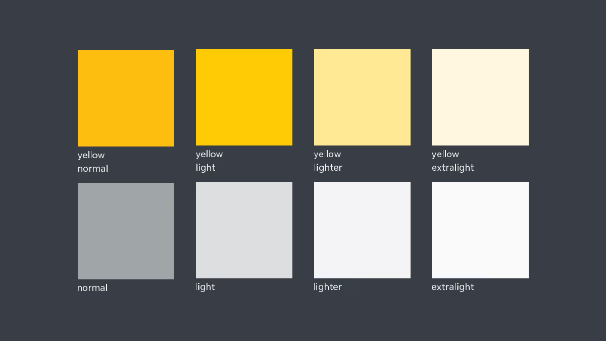
Colour palette
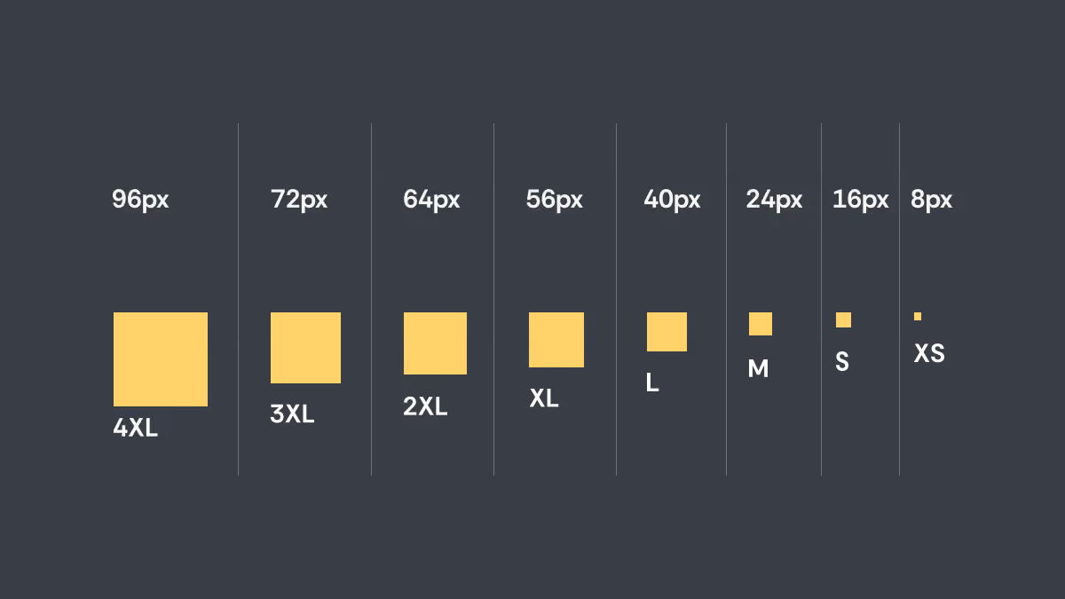
Spacing principles to guide the spacing between every elements
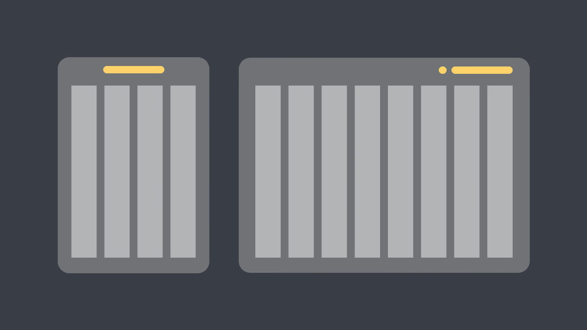
Grid system for page layout and breakpoint responsiveness
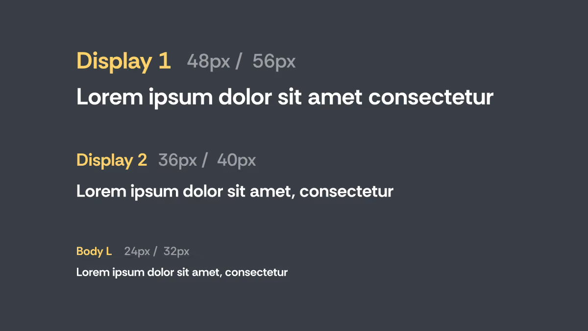
Typography system for good readability and hierarchy control
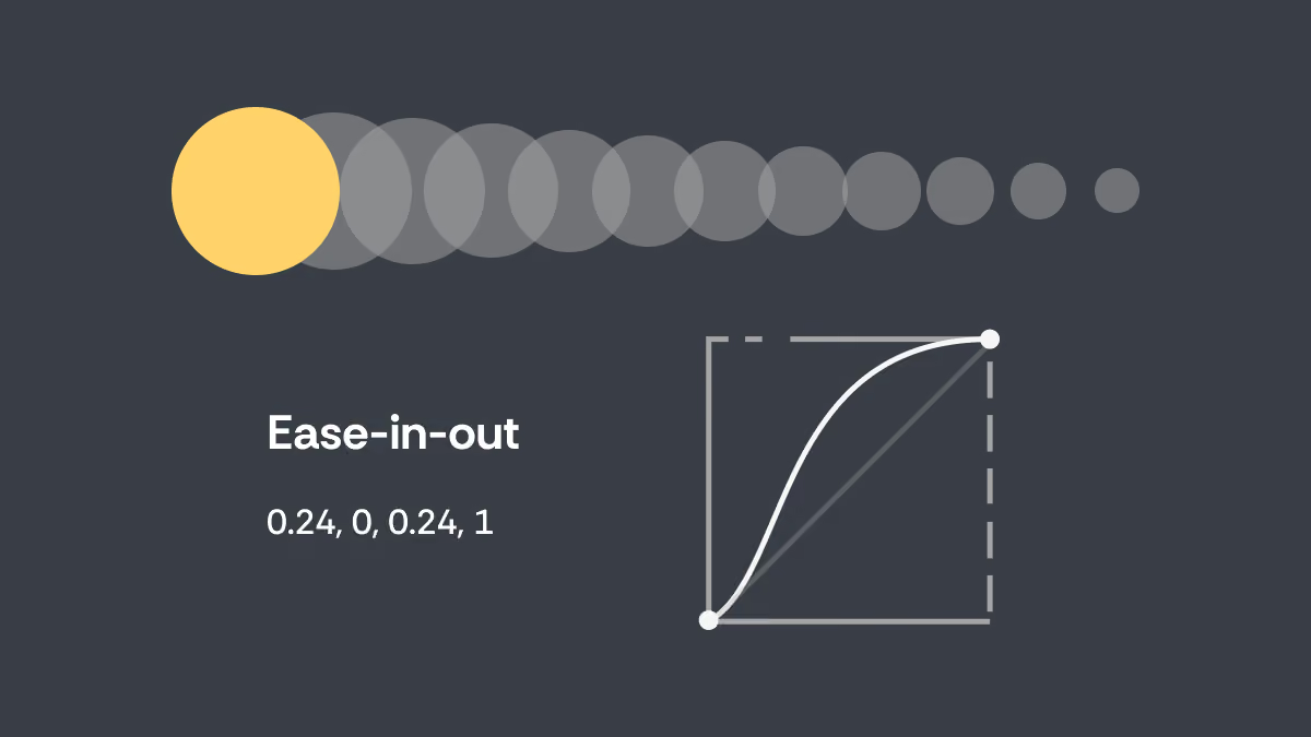
Animation principles that ensure consistency and enhance usability
/3
components & patterns
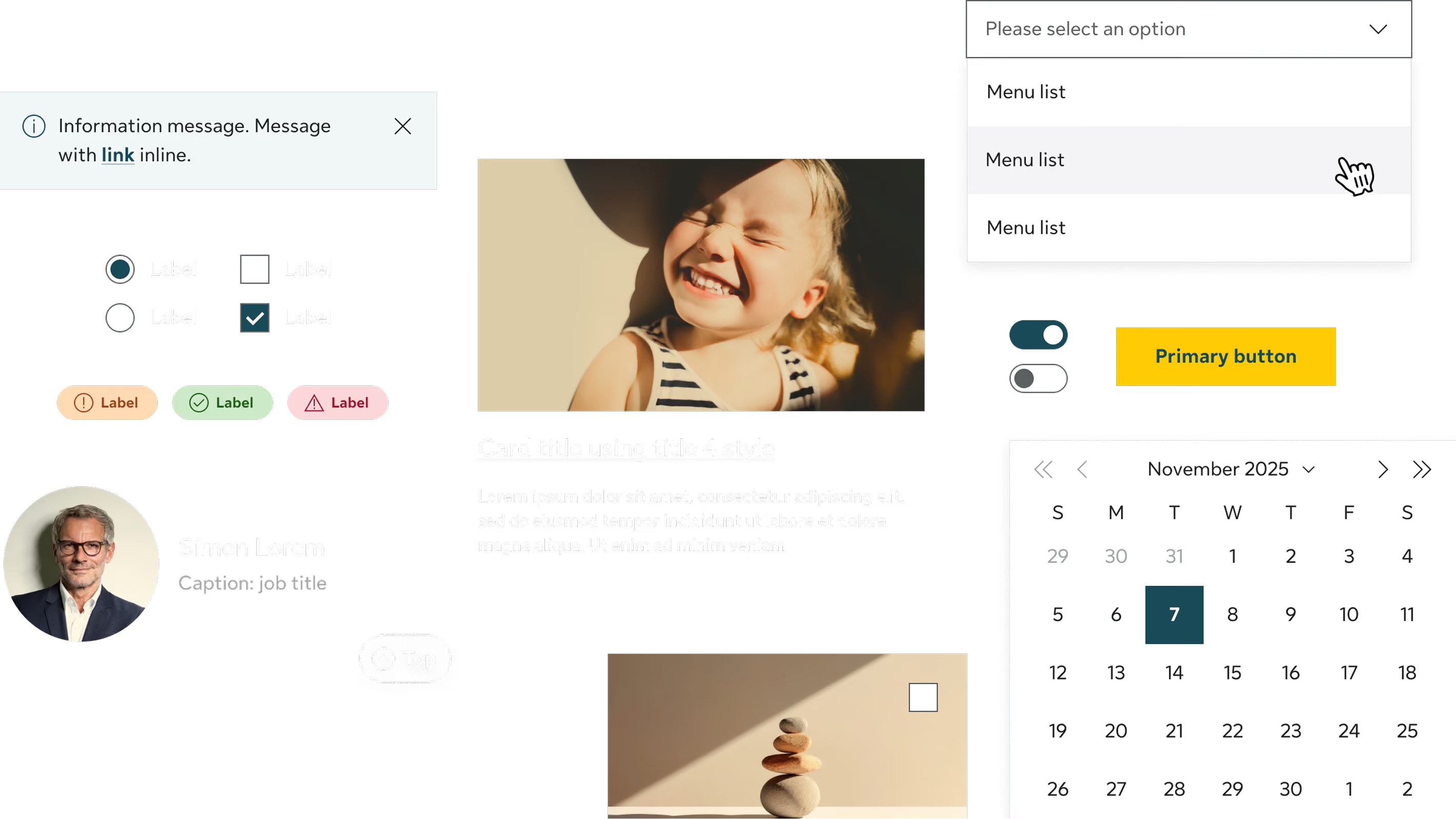
Beyond visual consistency, each component was designed with usability and flexibility in mind. We defined component behaviors, states, and interaction patterns, ensuring components could provide predictable experiences across different platforms.
To ensure components are usable by everyone, each component underwent continuous refinement based on feedback from designers, developers, and product teams.
To ensure components are usable by everyone, each component underwent continuous refinement based on feedback from designers, developers, and product teams.
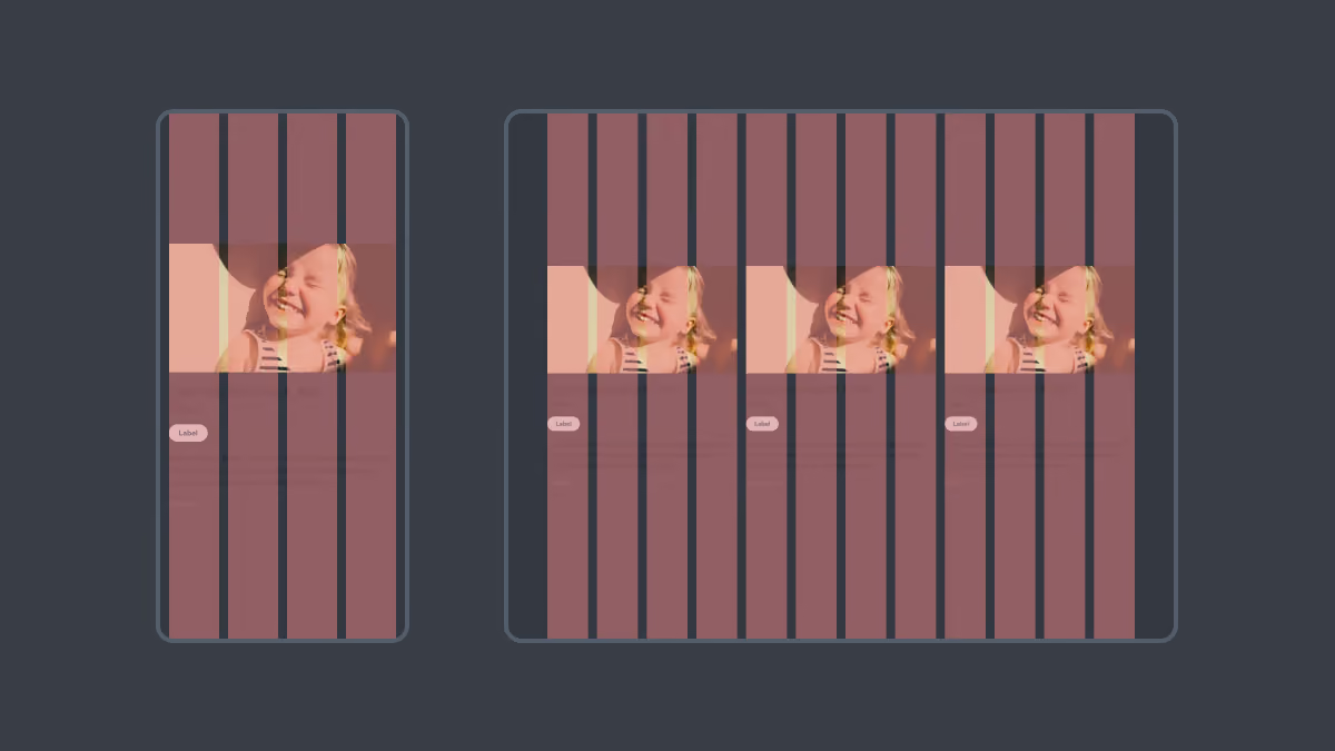
Scalable across all breakpoints and devices
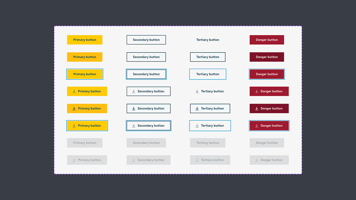
Variants and states
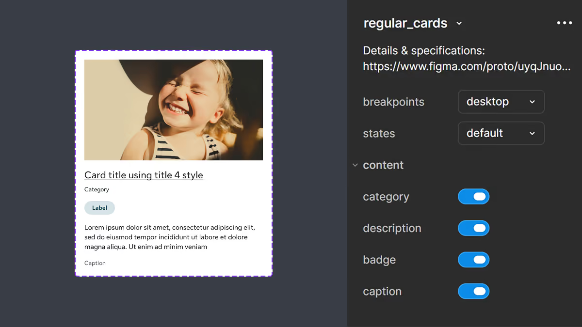
Configurable for designers
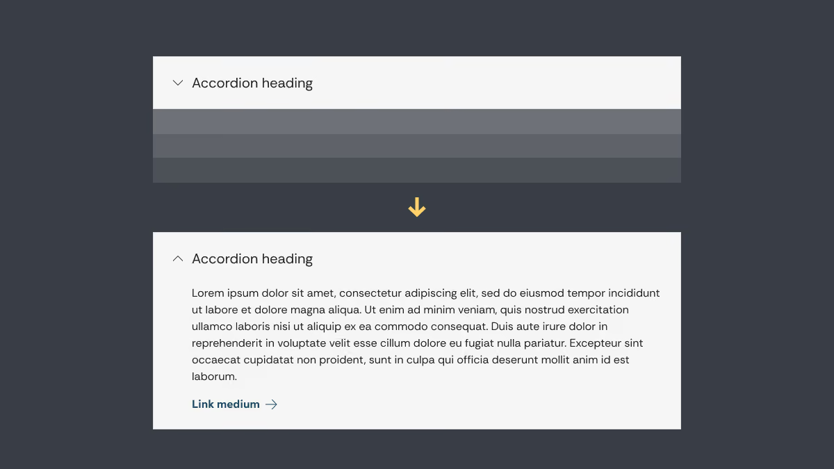
Animated prototypes for visualizing component interactions
/4
accessibility
Accessibility was one of the highest priorities throughout the development of Helios. As a core value at Sun Life, every component and interaction was designed to meet high accessibility standards while delivering an inclusive and consistent experience for all users.
To strengthen my understanding of accessibility standards and best practices, I completed the W3Cx Web Accessibility course on edX, allowing me to apply accessibility principles more effectively throughout the design system.
To strengthen my understanding of accessibility standards and best practices, I completed the W3Cx Web Accessibility course on edX, allowing me to apply accessibility principles more effectively throughout the design system.
Accessibility considerations were incorporated into component design, including:
WCAG 2.2 AA colour contrast, keyboard navigation support, visible focus states, screen reader compatibility, clear labels and instructions and sufficient touch target size etc.
WCAG 2.2 AA colour contrast, keyboard navigation support, visible focus states, screen reader compatibility, clear labels and instructions and sufficient touch target size etc.
/5
implementing design tokens
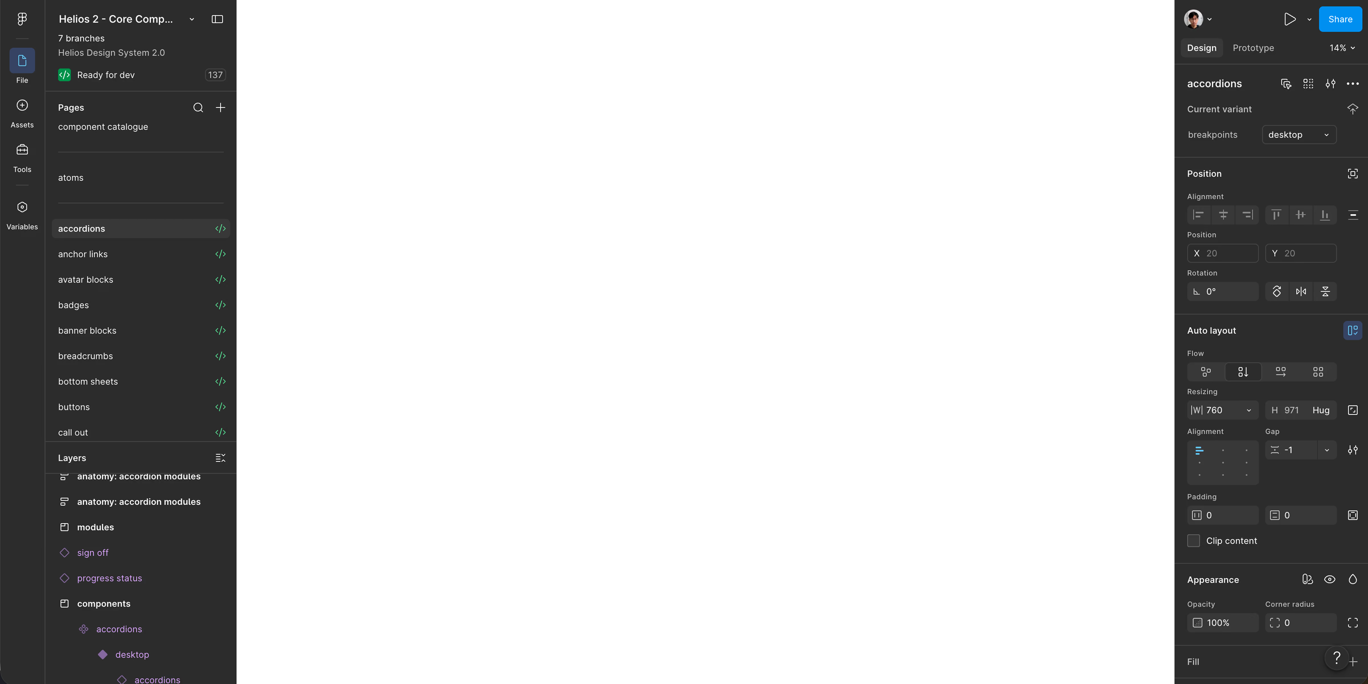
In 2023, Figma has released a update that allows creation of variables and design tokens. To improve scalability and maintainability, we leveraged Figma variables and design tokens to restructure Helios’ foundations and components. This created stronger connections between design decisions, allowing updates to propagate more efficiently across the entire system.
By introducing tokens, Helios will be easier to maintain, adjust, and scale to serve new products and new requirements.
By introducing tokens, Helios will be easier to maintain, adjust, and scale to serve new products and new requirements.
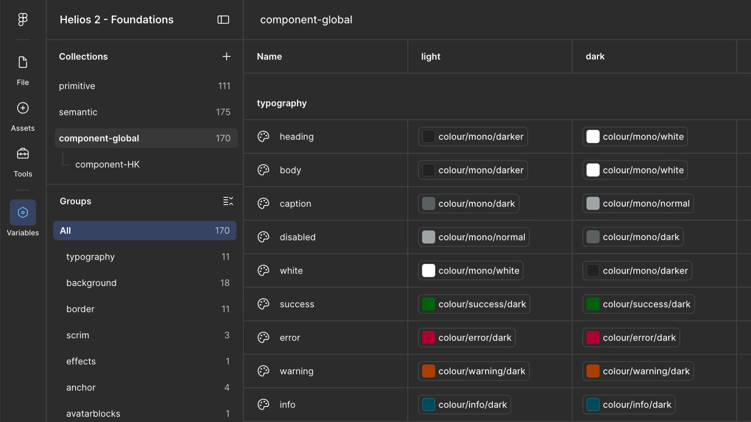
Figma Variables
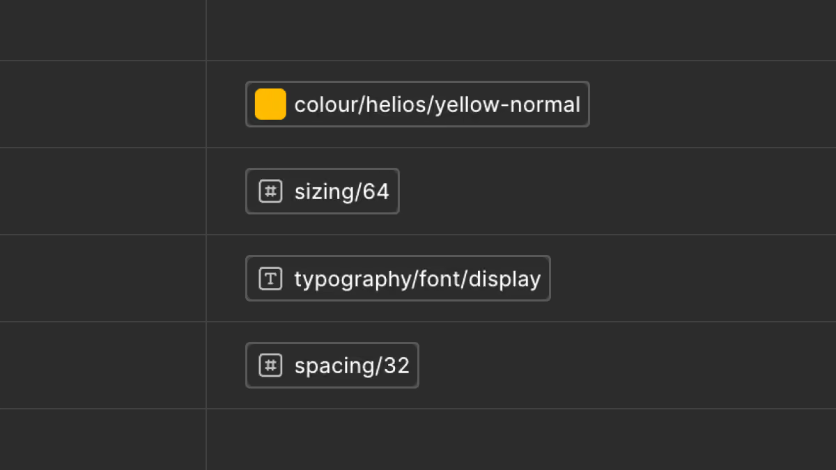
Tokens example of color, size, typography and spacing. We also created easing and duration tokens for animation and prototyping.
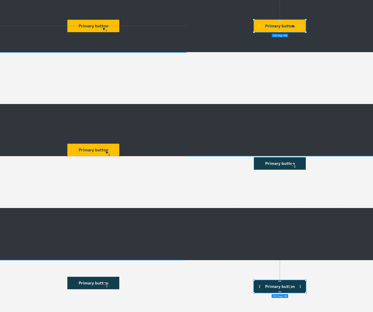
Component style changes based on variable mode
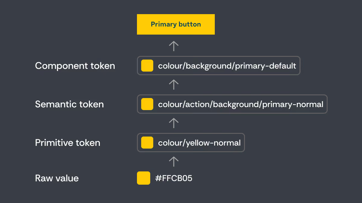
Token structure
beyond the system
/ team enablement
enabling teams through documentation
A successful design system is not only defined by its components, but also by how easily the teams can understand and adopt it.
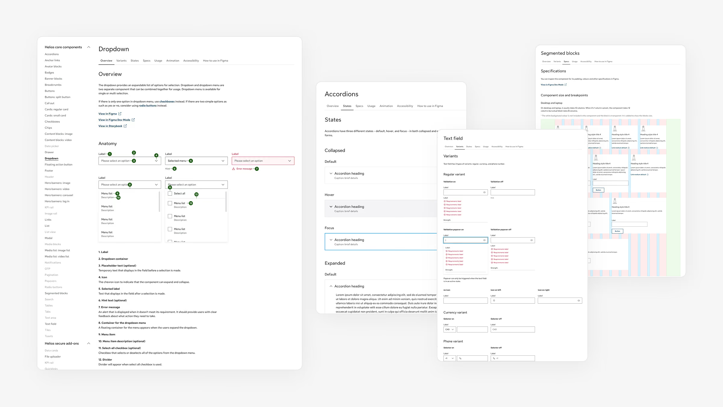
To support designers and developers, I created comprehensive documentation covering component usage, behaviors, interaction guidelines, accessibility requirements, and implementation best practices. Each component included clear guidance on when and how it should be used, helping teams make consistent design decisions across products.
To support designers and developers, I created comprehensive documentation covering component usage, behaviors, interaction guidelines, accessibility requirements, and implementation best practices. Each component included clear guidance on when and how it should be used, helping teams make consistent design decisions across products.
/ adoption
bringing Helios into real products
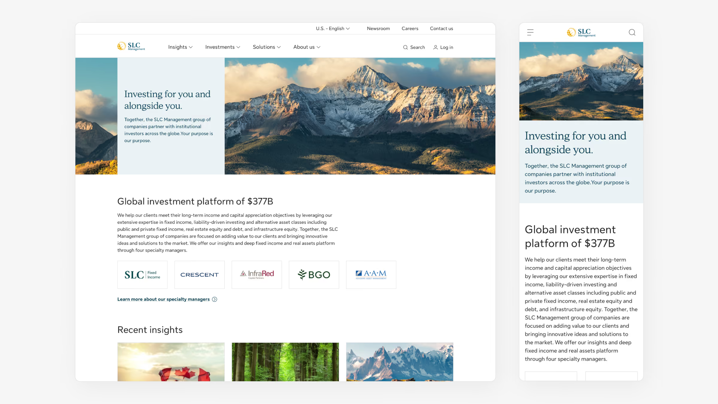
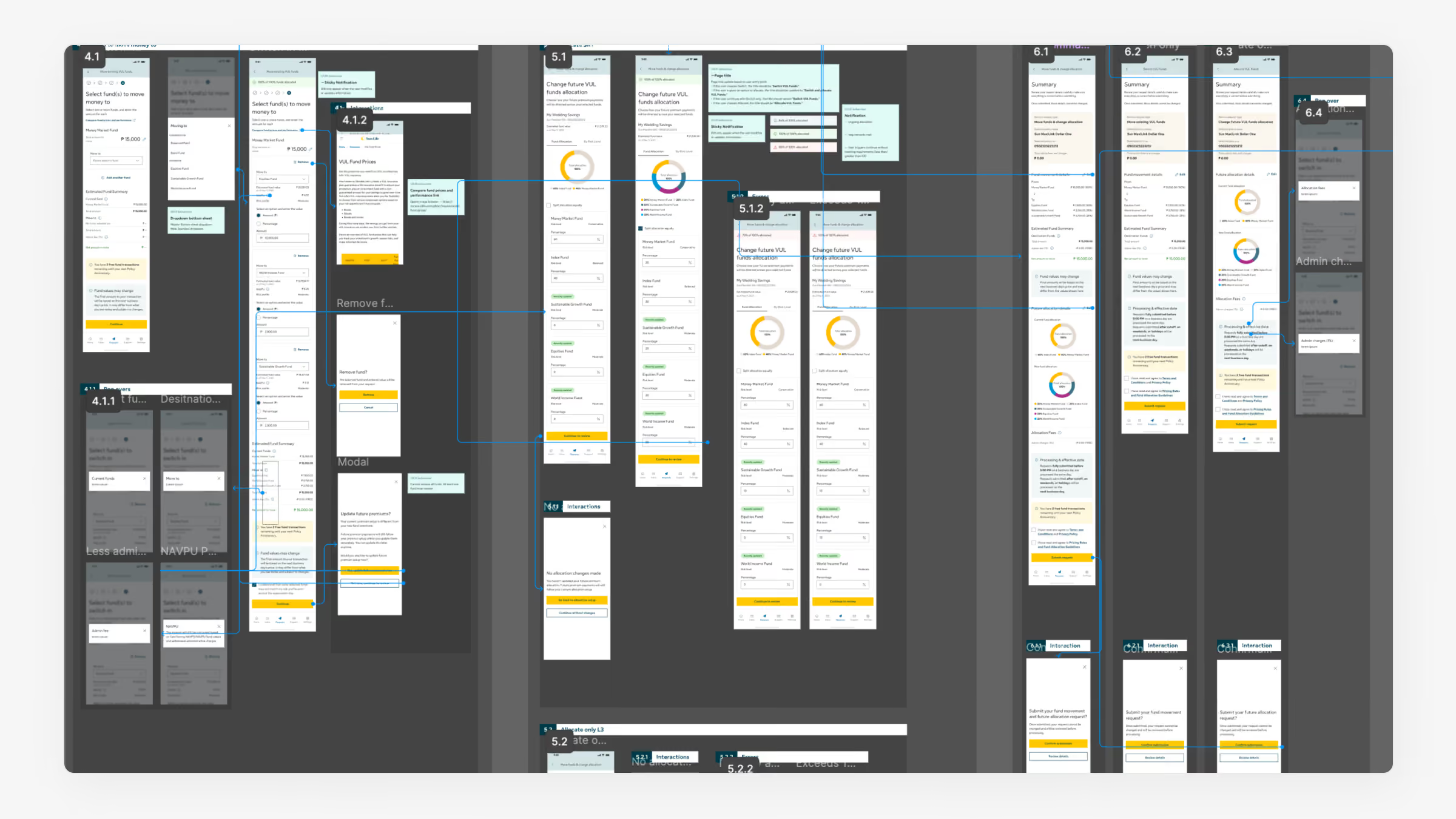
Using Helios as the design foundation, I contributed to the design of multiple global websites and mobile applications, helping multiple teams transition from legacy interfaces to a more modern and consistent user experience.
/ result
Helios by the numbers
100%
Public-site adoption
$1.5M
Development efficiency generated in 2025
1.76M
Component uses across web & mobile

.svg)